Industry

Healthcare

Client

Happence

Redesigned a wellbeing platform used by enterprise clients.

Redesigned a wellbeing platform used by enterprise clients.

Redesigned a wellbeing platform used by enterprise clients.

Overview

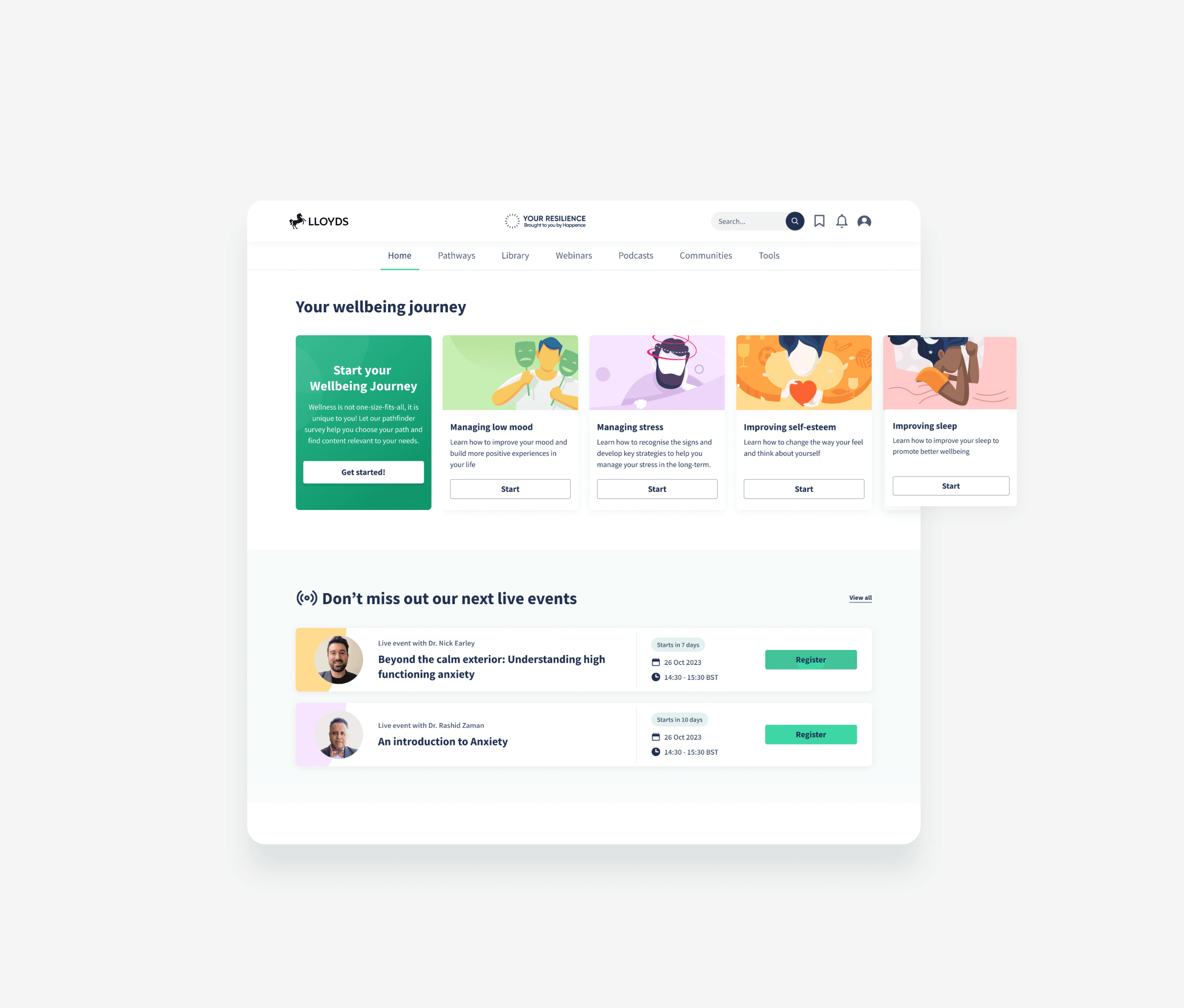
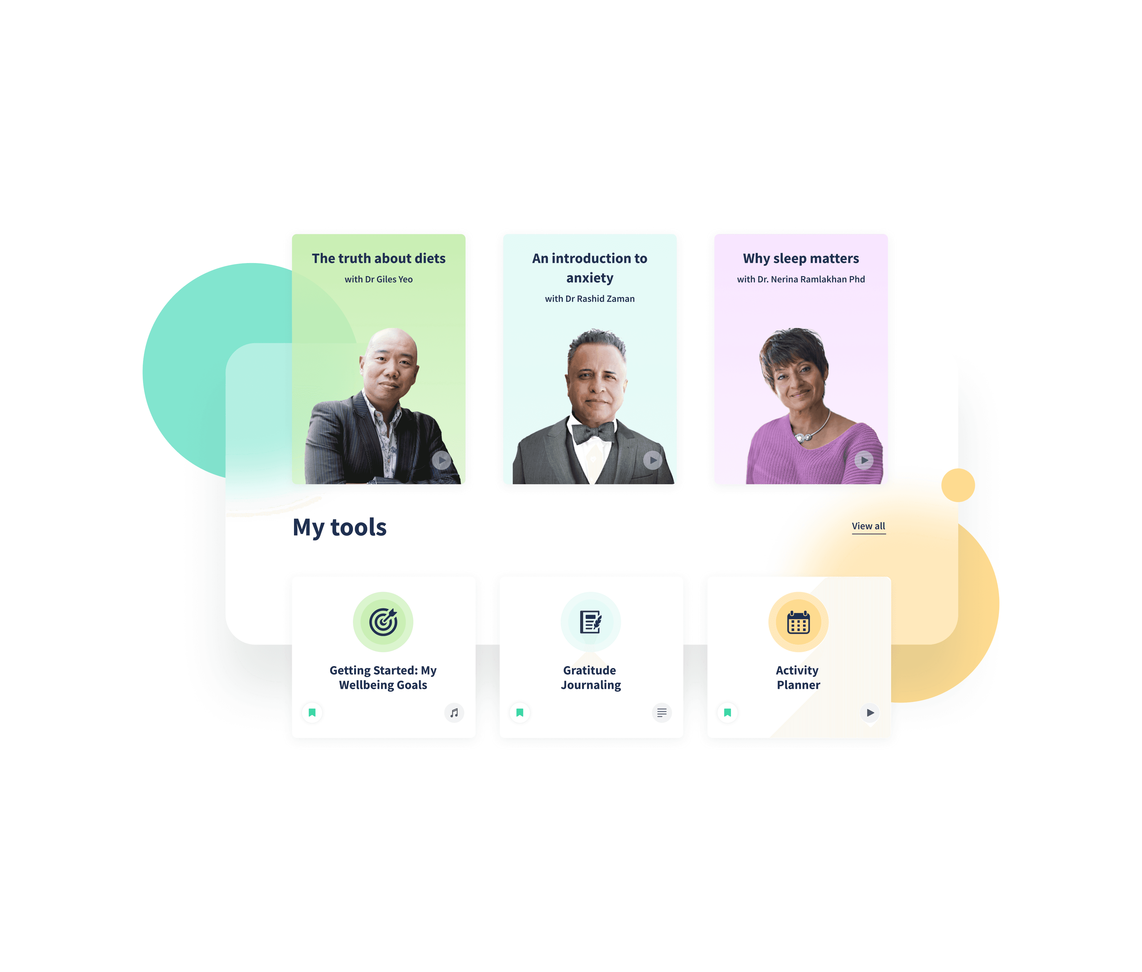
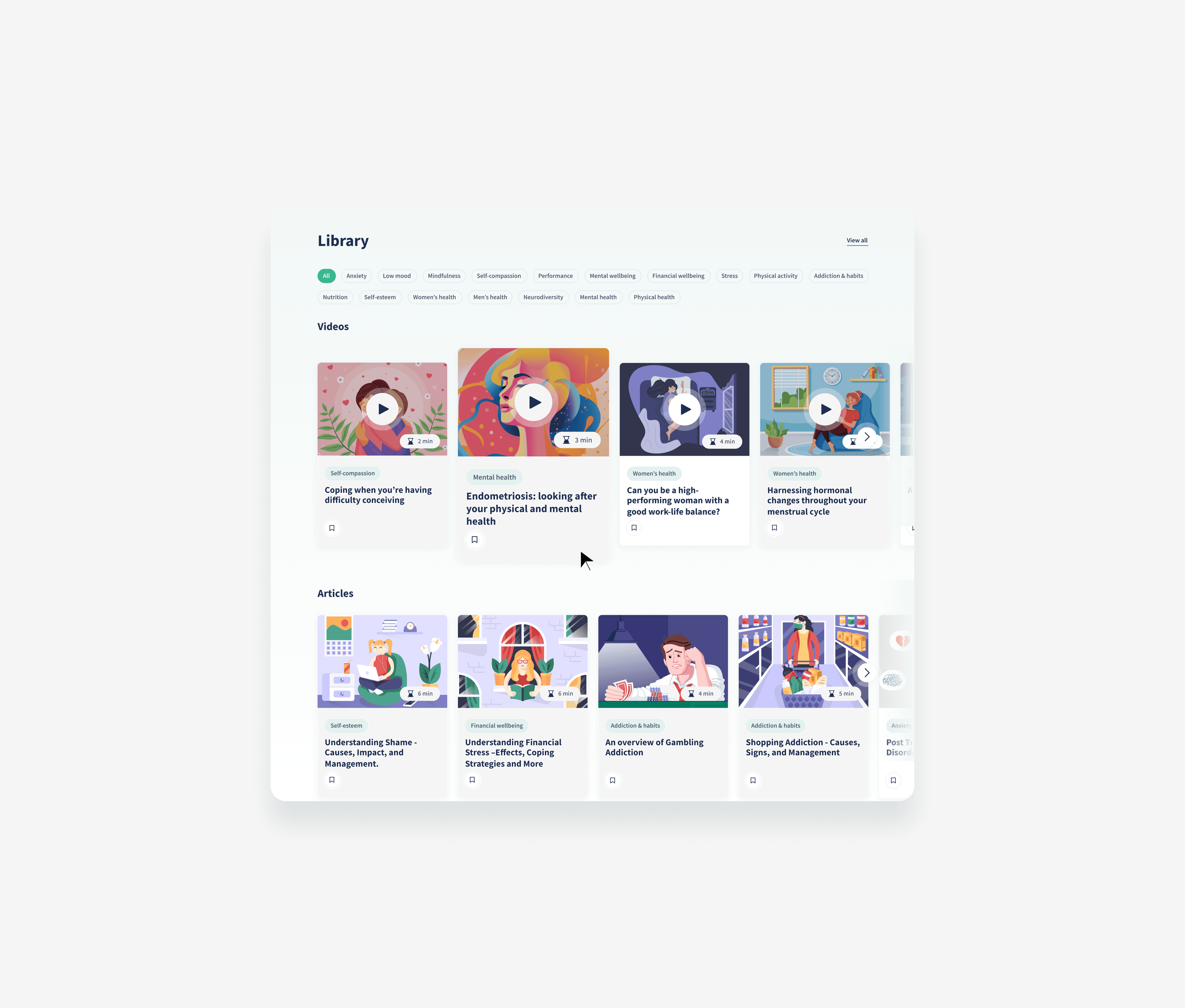
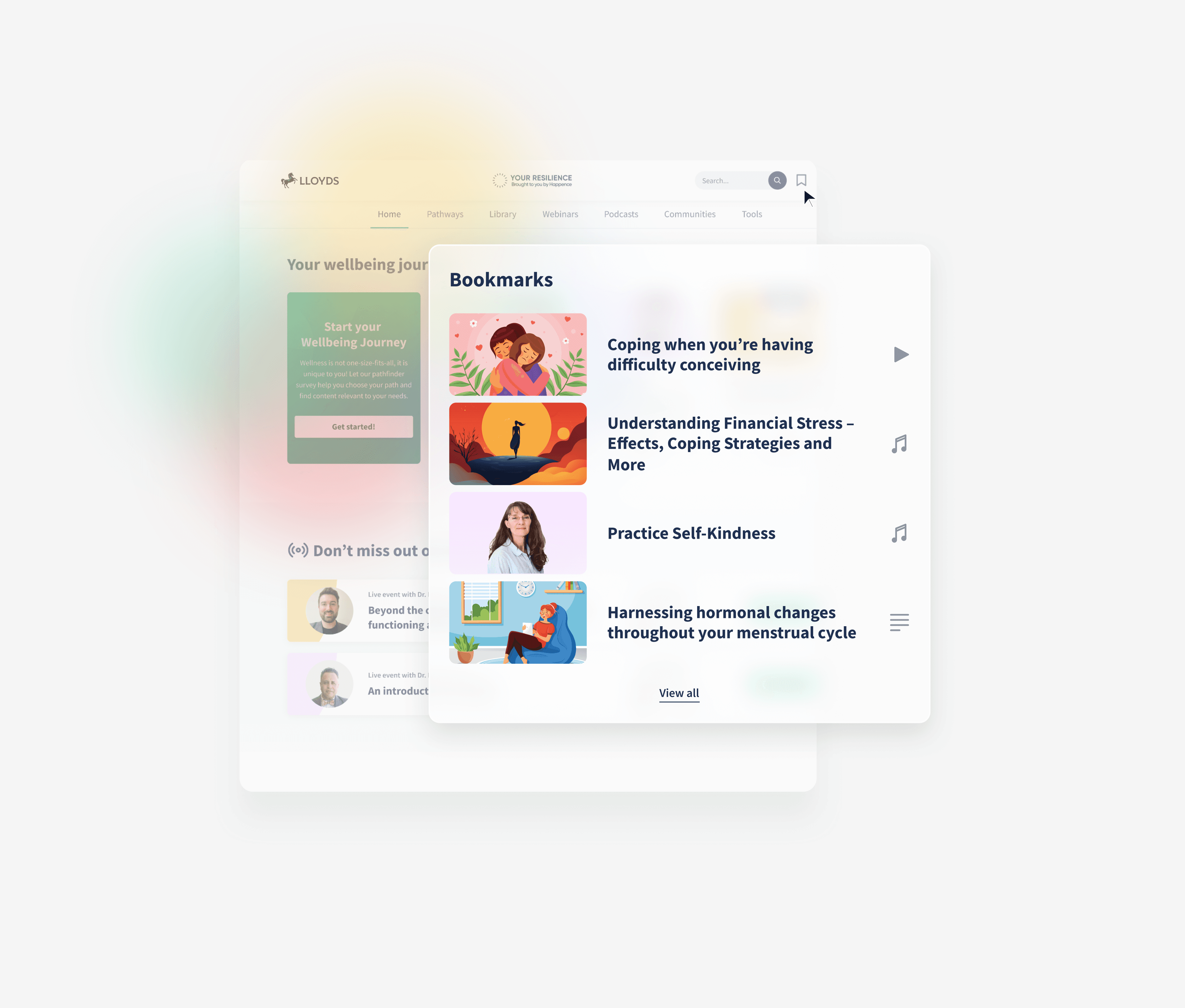
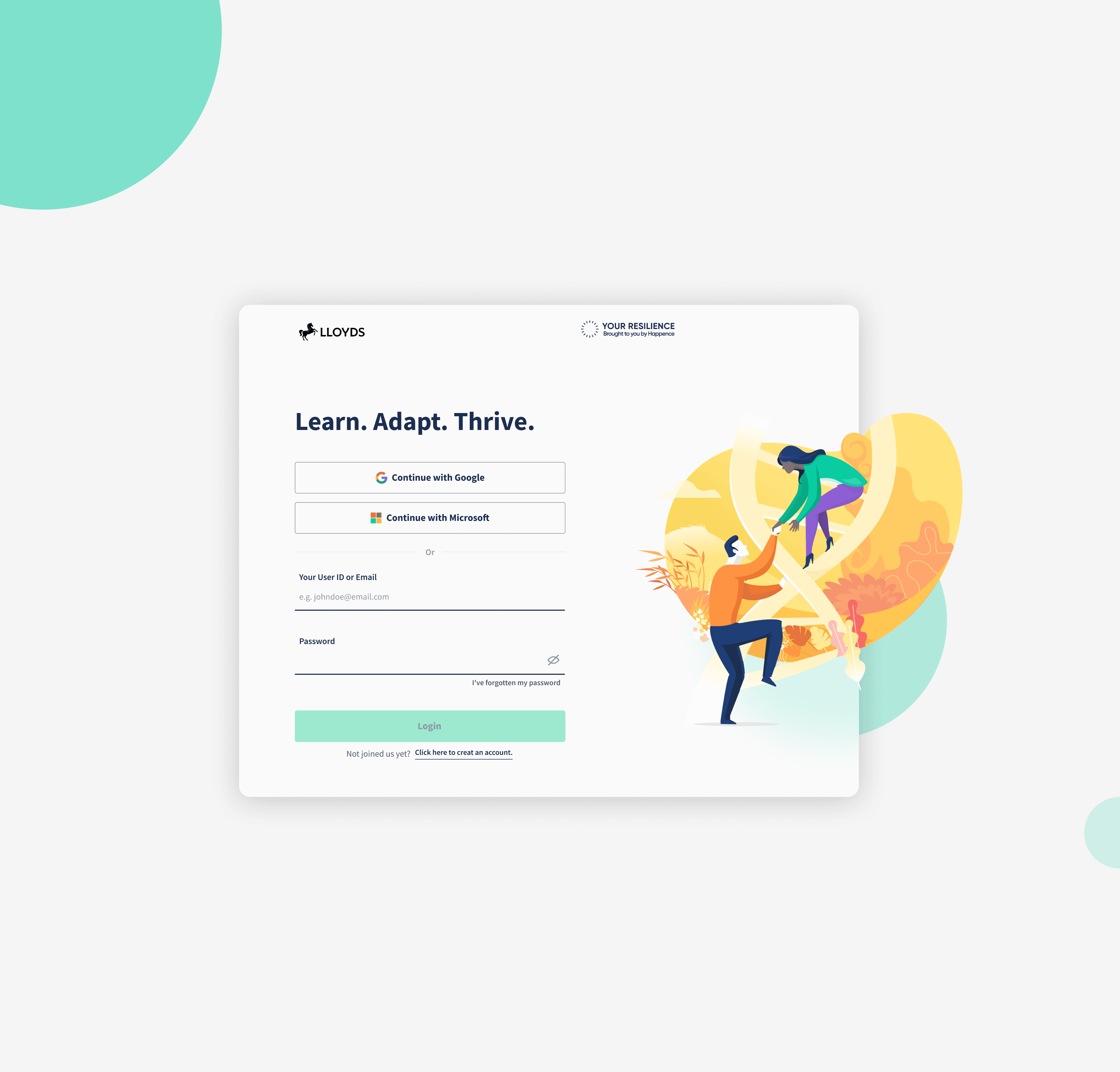
Happence is a digital wellbeing platform used by large UK organizations to support employee mental health. The platform offers articles, videos, podcasts, live events, and personalized content paths tailored through guided questions.


I joined the project at a stage where the product had grown organically over time and needed clarity, consistency, and a stronger user experience foundation.

The Challenge

The Challenge

As the platform expanded, design decisions were made incrementally without a dedicated design direction. This resulted in:

As the platform expanded, design decisions were made incrementally without a dedicated design direction. This resulted in:

• Visual inconsistencies across screens

• Uneven usability between key areas

• A product experience that felt complex and fragmented for users

The challenge was to bring structure and cohesion to an already complex system, while respecting existing constraints and business needs.

Design Approach

Design Approach

Design Approach

My focus was on simplifying and organizing the experience without stripping away functionality. I approached the redesign by:

🔲 Clarifying core user journeys across the platform

🔲 Introducing stronger hierarchy and visual structure

🔲 Creating a more friendly and approachable interface

Platform Experience

Platform Experience

Platform Experience

The redesigned experience guides users more clearly through their wellbeing journey—from onboarding and discovery to ongoing engagement with content and events.

Key areas such as dashboards, content libraries, and personalized recommendations were refined to feel more intuitive and less overwhelming, while still supporting the platform’s depth and variety.

Content & Discovery

Content & Discovery

Because Happence relies heavily on content, special attention was given to how users discover and return to relevant materials. Articles, videos, podcasts, and live events were structured in a way that feels easy to browse, scan, and revisit.

Clear categorization and consistent layouts help users focus on what matters most at each moment of their wellbeing journey.

Clear categorization and consistent layouts help users focus on what matters most at each moment of their wellbeing journey.

Clear categorization and consistent layouts help users focus on what matters most at each moment of their wellbeing journey.

Outcome

Outcome

The result was a more structured, consistent, and user-friendly wellbeing platform that:

✅ Feels calmer and easier to navigate

✅ Supports complex content without overwhelming users

✅ Provides a stronger foundation for future growth